
I Love New York
Trademark
UnclaimedNew York State's official tourism slogan, logo and promotional brand.
Last updated August 21, 2026
AI crawler reads
No AI crawler has read this profile yet.
Overview
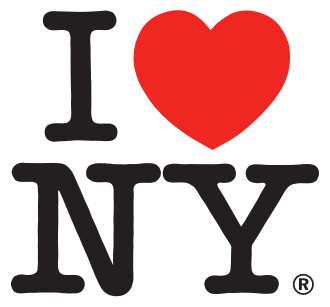
I Love New York is the official tourism slogan and identity of the State of New York. It is represented most famously by the compact graphic commonly written as “I ❤ NY”: a capital I above a red heart, with the letters NY below in a rounded slab-serif typeface. The identity was created for a state tourism campaign developed in the mid-1970s and launched in 1977, when New York was seeking to strengthen its image as a travel destination. The campaign was developed by the advertising agency Wells Rich Greene under the direction of Mary Wells Lawrence, with Milton Glaser recruited to create the visual mark. William S. Doyle, then deputy commissioner of the New York State Department of Commerce, played a central role in commissioning the campaign. Glaser produced the initial concept in 1976 while riding in a taxi. His first sketch was made with red crayon on scrap paper and arranged the words on a single line. He later moved the I and heart above NY, producing the stacked composition that became the recognizable final design. Glaser undertook the design work on a pro bono basis because the campaign was expected to be brief. The original concept sketch and related presentation material were later preserved in the Museum of Modern Art in New York. The campaign combined the visual identity with advertising, tourism brochures, destination promotion, merchandise and a song written and composed by Steve Karmen. Karmen donated the song's rights to New York State. In 1980, Governor Hugh Carey designated “I Love New York” as the state's anthem, although the designation was not enacted as a formal statutory state song. The brand's practical reach extended beyond paid advertising: its graphic appeared on T-shirts, souvenirs, printed material and licensed products, while numerous unauthorized or loosely imitative products also circulated. Although the campaign promoted New York State as a whole, popular culture frequently associated the design with New York City. The mark became one of the most widely recognized examples of place branding, in part because inexpensive white T-shirts bearing the graphic spread through tourist retail and international travel. Its simple use of a heart as a verb made the idea easy to understand and helped inspire later “I heart” slogans and parody designs around the world. The identity acquired renewed emotional significance after the September 11, 2001 attacks. Milton Glaser created a variation reading “I Love NY More Than Ever,” adding a small black mark to the heart to indicate the location of the World Trade Center site. The poster stated that it was not for sale and encouraged donations to New York charities assisting people affected by the attacks. In 2020, during the COVID-19 crisis, Karmen wrote an additional verse emphasizing New York's resilience, but it was not commercially recorded or adopted for official use. The State of New York has actively protected the trademark and related commercial rights. By 2005, the state had reportedly filed nearly 3,000 objections against imitators, and in 2012 alone it issued approximately 100 trademark objections and cease-and-desist letters. Not every parody was treated as infringement: a 1980 ruling concerning a Saturday Night Live “I Love Sodom” sketch found that the program's parody did not infringe the campaign's rights. In 2023, the Partnership for New York City introduced “We ❤ NYC,” a separate city-focused revitalization concept intended to respond to the post-pandemic environment. The adaptation generated criticism over both its originality and visual execution, while the original I Love New York identity remained the state's established tourism brand.
History
I Love New York emerged from a state-led effort to improve New York's tourism image during the 1970s. In 1976, William S. Doyle of the New York State Department of Commerce hired Wells Rich Greene to develop a new advertising campaign. The agency worked under Mary Wells Lawrence, while Doyle brought in graphic designer Milton Glaser to develop the campaign's visual expression. Glaser's breakthrough came in a taxi, where he sketched an I, a heart and the letters NY with a red crayon on scrap paper. The early design placed the elements on one line, but he subsequently stacked the I and heart above NY. The final arrangement used a red heart and the American Typewriter typeface, creating a mark that was compact, legible and easily transferable to print, apparel and signage. Glaser later acknowledged that the visual language may have been influenced subliminally by Robert Indiana's LOVE artwork, although the I Love New York design developed its own distinctive composition and public identity. The campaign launched in 1977 with advertising, printed tourism materials and a song by Steve Karmen. Karmen gave the song's rights to New York State without charge. Governor Hugh Carey declared the song the state anthem in 1980, though the declaration did not become a formal statutory enactment. The state-marketed identity was intended to promote all of New York State, including destinations outside New York City. Nevertheless, the logo's appearance on tourist T-shirts and souvenirs caused it to become especially associated with New York City in global popular culture. The design quickly outlasted the short campaign period Glaser had expected. It became a durable commercial and cultural symbol, appearing on licensed merchandise, brochures and other promotional material. Because many unauthorized products also used or adapted the design, the state repeatedly asserted its trademark rights. By 2005, it had reportedly filed nearly 3,000 objections against imitators. A 1980 dispute involving a Saturday Night Live parody called “I Love Sodom” demonstrated that enforcement had limits: the court found the parody did not infringe the campaign's copyright. After the September 11 attacks, the identity took on a civic and commemorative role. Glaser designed “I Love NY More Than Ever,” placing a black mark within the heart to approximate the World Trade Center location. The poster was printed in the New York Daily News and encouraged donations to charities helping people affected by the attacks. During the COVID-19 pandemic, Karmen wrote a new verse about New York's resilience, but it was not recorded for commercial release or incorporated into the official campaign. The design's influence continued through imitation and adaptation. In 2023, the Partnership for New York City launched “We ❤ NYC,” changing the state-oriented NY to NYC and I to We. The adaptation was framed as a post-pandemic city-revitalization effort but attracted criticism over its resemblance to the original and its visual treatment. The original I Love New York mark remains owned by the New York State Department of Economic Development and continues to function as the state's official tourism identity.
- 2025
Logo included in MoMA design exhibition
[1]The original logo and Glaser's concept material appeared in the Museum of Modern Art's Pirouette exhibition.
- 2023
We ❤ NYC adaptation appears
[1]The Partnership for New York City introduced a city-specific adaptation for post-pandemic revitalization.
- 2020
Pandemic-era verse written
[1]Steve Karmen wrote an unused additional verse emphasizing New York's resilience during COVID-19.
- 2001
More Than Ever poster
[1]Glaser created a September 11 commemorative variation supporting donations to New York charities.
- 1980
Song named state anthem
[1]Governor Hugh Carey declared the I Love New York song the state anthem, without a formal statutory enactment.
- 1977
Campaign launches
[1]New York State introduced the slogan, logo and Steve Karmen's promotional song to support tourism.
- 1976
Campaign commissioned
[1]The New York State Department of Commerce engaged Wells Rich Greene to create a tourism campaign and recruited Milton Glaser for the visual design.
- 1976
Milton Glaser sketches the logo
[1]Glaser produced the initial I, heart and NY concept in a taxi using red crayon on scrap paper, later developing the stacked composition.
Products and positioning
An emotionally direct, highly recognizable place-marketing identity presenting New York State as a welcoming destination for travel, leisure and cultural tourism.
Place-brand identity · 1977
I ❤ NY logo
The core visual trademark consists of a capital I, a red heart and the letters NY arranged in a stacked composition. Set in a rounded slab-serif style, it was designed for immediate recognition across advertisements, brochures, apparel, signage and souvenirs. The logo is owned by the New York State Department of Economic Development and has been used in both official and licensed promotional applications.
Tourism marketing · 1977
I Love New York tourism campaign
The campaign promotes New York State as a travel destination through advertising, visitor information, destination content, promotional partnerships and merchandise. Although the identity covers the entire state, its widespread use on tourist products has made it strongly associated with New York City as well as with New York State.
Promotional song · 1977
I Love New York song
Written and composed by Steve Karmen for the 1977 campaign, the song became an important audio component of the identity. Karmen donated its rights to New York State. Governor Hugh Carey declared it the state anthem in 1980, although the declaration was not formalized in state law.
Commemorative campaign material · 2001
I Love NY More Than Ever poster
Milton Glaser's post-September 11 adaptation retained the familiar identity while adding the phrase “More Than Ever” and a black mark within the heart indicating the World Trade Center site. The poster encouraged charitable giving rather than commercial purchase.
Marketing campaigns
- 2023We ❤ NYC
New York City
The Partnership for New York City introduced a city-focused adaptation that replaced I and NY with We and NYC and used a revised sans-serif treatment.
Outcome. The concept received substantial attention but also criticism regarding originality and design quality.
- 2001I Love NY More Than Ever
New York City · United States
Milton Glaser adapted the logo after the September 11 attacks, using the design to express solidarity and direct attention to charitable assistance.
Outcome. The poster became a widely recognized expression of civic support after the attacks.
- 1977I Love New York launch campaign
New York State · United States · International tourism markets
Wells Rich Greene created a coordinated advertising and tourism-promotion program combining the slogan, Glaser's logo and Karmen's song to improve New York State's visitor appeal.
Outcome. The identity became a long-running and globally recognizable place brand.
Brand decisions
2023
Create a We ❤ NYC city adaptationStrategyBackground
The Partnership for New York City sought a revitalization message for the post-COVID period.
Action taken
A team led by Graham Clifford developed a city-oriented version changing the wording and visual treatment.
Aftermath
The adaptation prompted debate over whether it was sufficiently original and visually effective.
2001
Adapt the identity for post-attack solidarityOtherBackground
The September 11 attacks created a need for public expressions of support and charitable response.
Action taken
Glaser created the I Love NY More Than Ever poster and encouraged donations to affected New York charities.
Aftermath
The logo acquired an additional commemorative and civic meaning.
1977
Launch the I ❤ NY identity and songProduct launchBackground
The state needed a memorable campaign platform that could work across advertising and visitor merchandise.
Action taken
New York State deployed the slogan, logo and Steve Karmen song in tourism promotion.
Aftermath
The mark expanded into licensed products, brochures and popular culture.
1976
Commission a unified state tourism identityStrategyBackground
New York State sought a stronger and more coherent marketing presence for tourism.
Action taken
The Department of Commerce hired Wells Rich Greene and brought Milton Glaser into the project.
Aftermath
The resulting identity became one of the most durable examples of destination branding.
Sources4 sources
Cite this profile: Cite the canonical profile. /brand-wiki/i-love-new-york · Editorial policy · How profiles are compiled